
Payment
infrastructure
for African SMEs
Nearpays is an all-in-one financial platform that simplifies digital payments through AI-driven, contactless technology. It is the ideal solution for anyone seeking a modern and efficient way to receive payment and manage their finances.
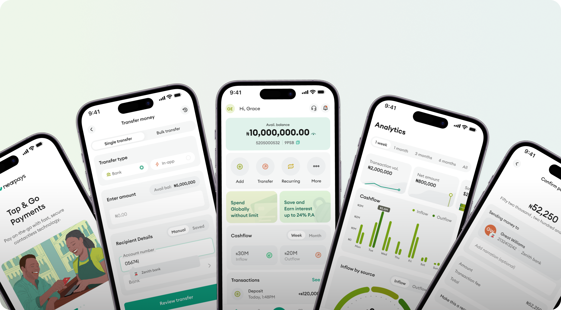
Designing the product meant addressing the realities of running a business across Africa, where fragmented financial tools and complex operational workflows create daily challenges. The goal was to deliver a dependable, intuitive experience that helps merchants accept payments, manage operations, and make smarter financial decisions from a single mobile-first platform.
Understanding the end users
My goal in conducting user interviews was to connect directly with business owners, understand their financial needs, and gain firsthand insights to inform the design. I wanted to create an experience that not only meets but exceeds their expectations.
of interviewees reported slow or unreliable POS terminals causing long checkout queues and abandoned purchases
of multi-branch owners did end-of-day reconciliation manually, by phone or spreadsheet leading to frequent accounting discrepancies
Expensive & unreliable physical POS hardware
Every few weeks something stops working — either the screen freezes, or the reader won't connect. I'm always scared it'll happen during lunch rush. It's like the hardware was designed to fail at the worst possible moment.
My POS terminal broke down on a Saturday afternoon, the busiest day of the week. I lost at least 15 customers because I couldn't take card payments. The repair alone cost more than what I made that day.
No real-time visibility across multiple branches
I manage three shops. Every evening I'm on the phone with three different managers just to know how much money came in. It takes over an hour and the numbers still don't always add up.
I have two salon locations and I can never tell which one is performing better unless I physically go there and check the book at the end of the week.
No all-in-one SMB solution
I use one app to receive dollars, another to convert, and another to pay my bills. It's exhausting. I just want one place that does all of it reliably.
I need to accept payments, track my daily sales, pay my suppliers, and file my tax — all in one place. Instead I'm jumping between four different apps and still things fall through the cracks. It costs me time I don't have.
User Journey Map
Based on the surveys and user interviews conducted, I mapped the end-to-end merchant journey to give Nearpays a competitive edge and to find a unique selling feature.
With a clear understanding of the challenges merchants faced,
I began exploring solutions that could eliminate friction
from their daily operations.
Userflow
01I started by mapping the end-to-end user flow to define the project scope and understand how merchants would navigate the platform. This helped establish a clear information architecture before moving into wireframing and interface design.
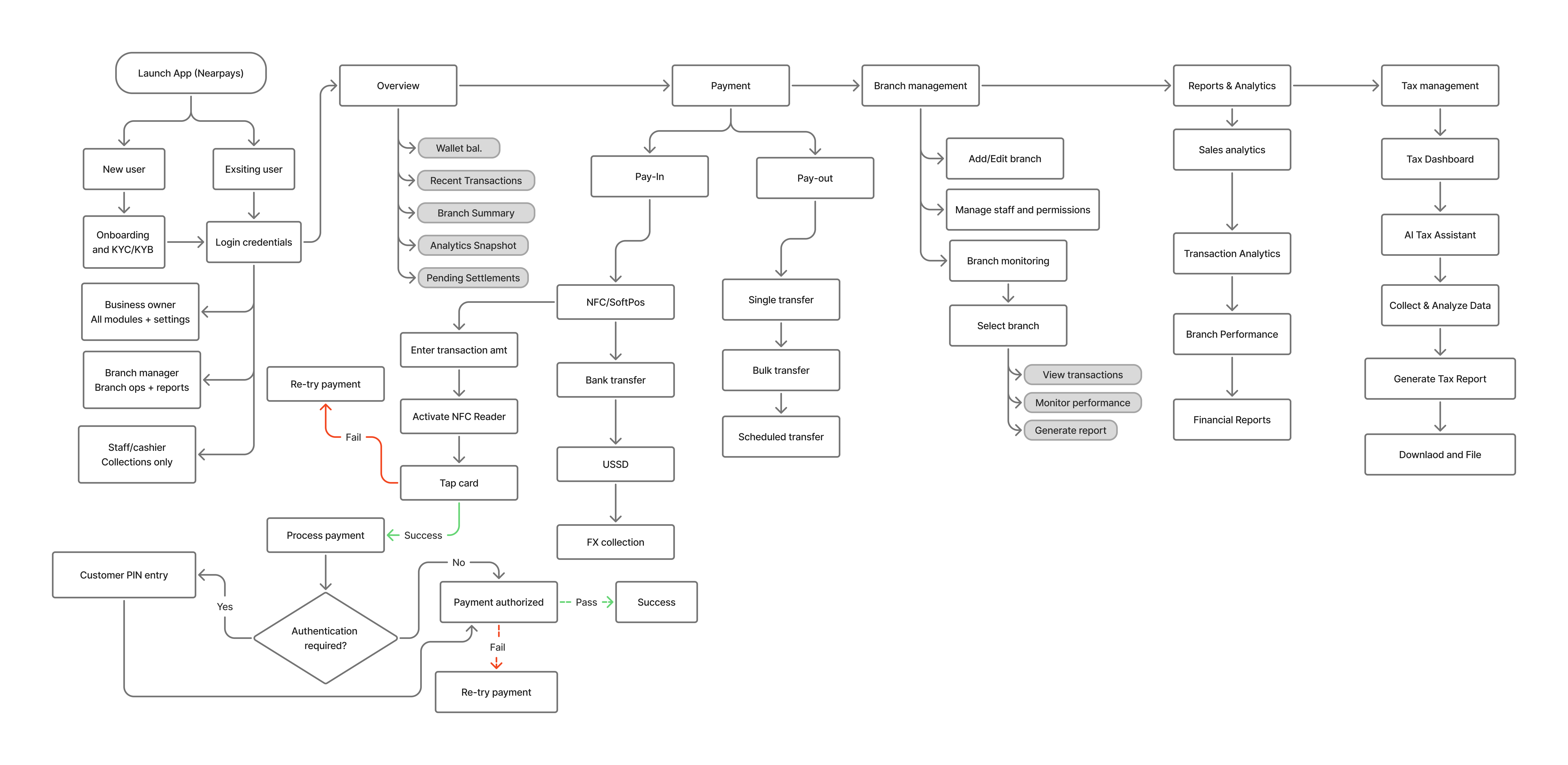
Best viewed on desktop
Sketches
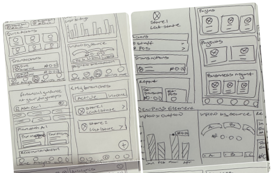
02I sketched the foundational layout for payments, branch management, analytics, and reconciliation.
Lo-fi wireframes
03I translated the paper sketches into low-fidelity wireframes to define the platform’s structure, validate core workflows, identify usability issues early, and gather feedback before moving to high-fidelity designs.
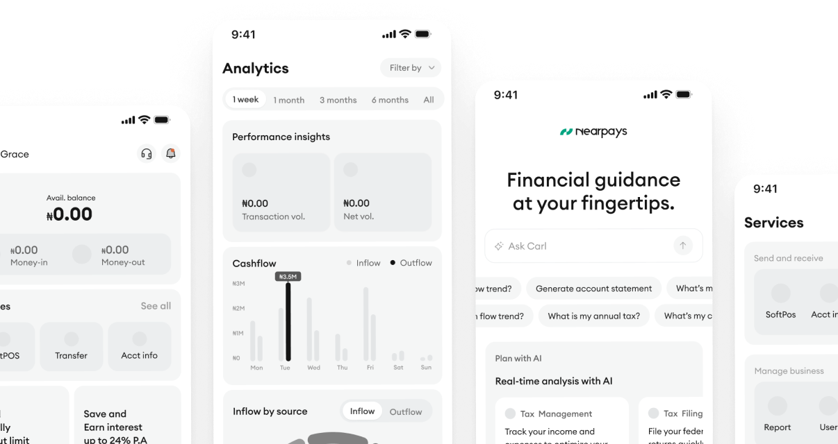
I tested the low-fidelity wireframes with internal stakeholders, refined the designs based on feedback, and then translated them into high-fidelity prototypes.
Why it matters: Internal feedback helped identify usability issues early and align the solution with business goals before conducting usability testing with external users.
A moderated usability study with 15 business owners who regularly use digital banking apps evaluated the app. The study achieved an 87% task success rate and a 4.8/5 user satisfaction score, exceeding the target KPIs.
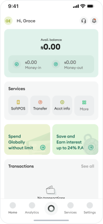
- 34% of users expected the Money In / Money Out card to be clickable.
- 20% of users found it difficult to navigate because they couldn't find the familiar “Add Money” and “Send Money” buttons.

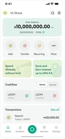
- Redesigned the card as a static summary and added clear visual cues to distinguish interactive elements from informational content.
- Added prominent “Add Money” and “Send Money” quick action buttons at the top of the dashboard to match users' mental models and improve discoverability.

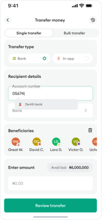
- 48% of users didn't realise the beneficiaries list could be scrolled horizontally, making it difficult to view all beneficiaries.
- 25% showed frustration in selecting the correct recipient, especially when contacts had similar names, causing hesitation.
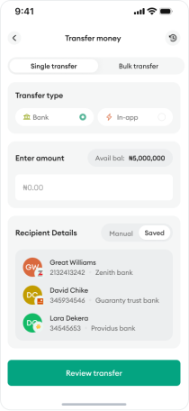
- Redesigned the beneficiaries flow by replacing the horizontal scroll with a vertical list that shows bank details, making it easier for users to identify and select the correct recipient with confidence.
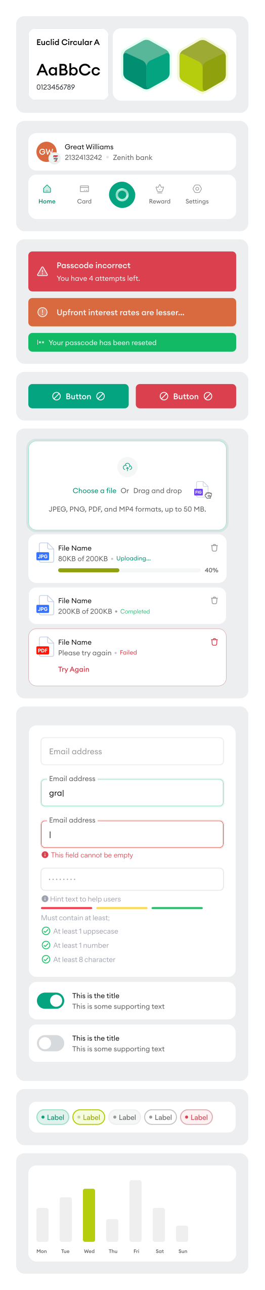
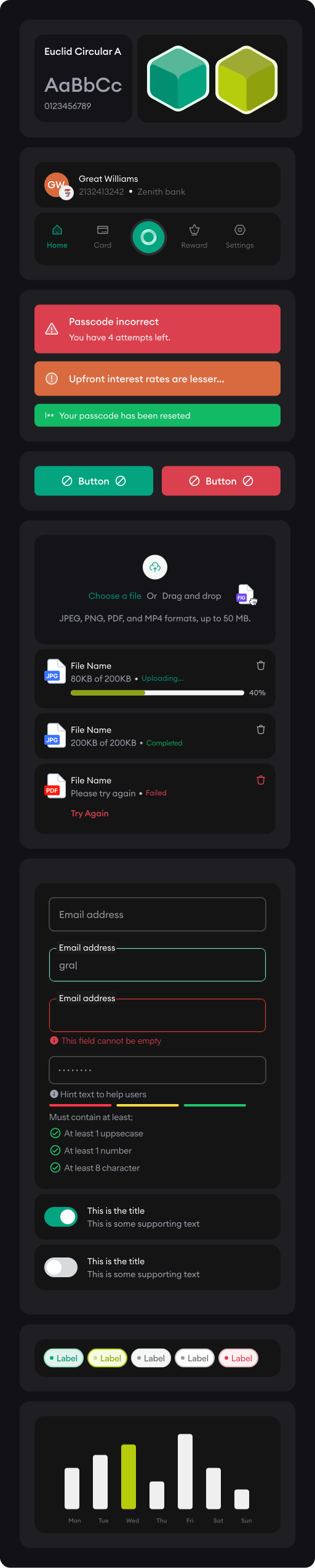
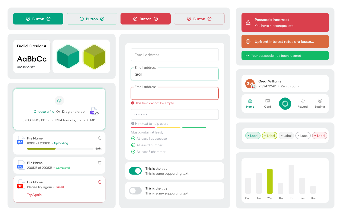
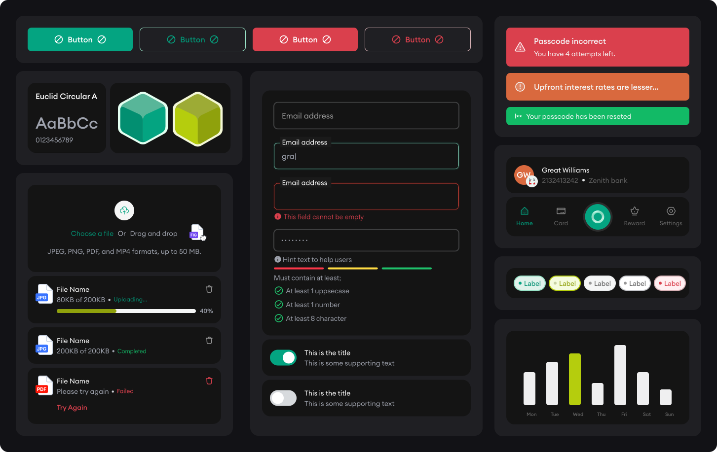
The design system served as a comprehensive guide defining the visual and interactive elements of the app. It includes standardised components, colour schemes, typography and layout guidelines to ensure a consistent and cohesive experience throughout.
Launching the Nearpays app
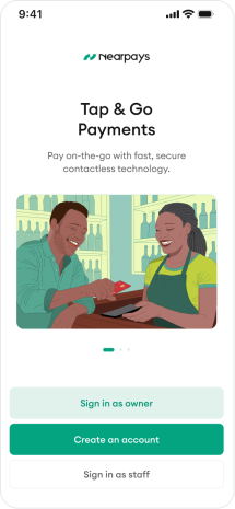
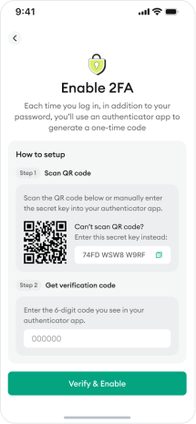
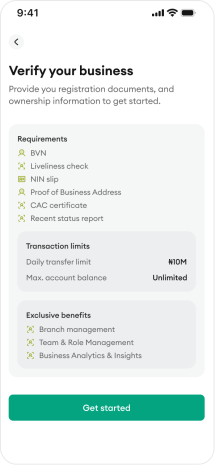
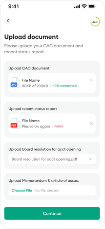
Nearpays was built with top-notch security features, offering a straightforward onboarding process that guides users through several verifications to keep their money safe. During registration, users provide personal and business information, and once the account is created, they’re asked to submit basic documents to verify their identity and business before they can start transacting on the app. They’re also encouraged to set up Face ID or 2FA for even more protected access to their account.

The app home page
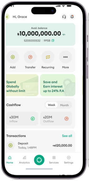
The app home page
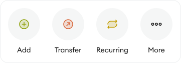
The home screen is designed for easy navigation. Account details are surfaced right at the top for quick access, since our research showed users often need to share them fast to receive funds. From there, users can top up their account, send money via single or bulk transfer, and set up recurring payments with just a few taps while the More option reveals additional features as needed.
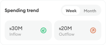
Another great feature is how easily users can keep track of their weekly or monthly cashflow. For a deeper look, they can head to the reports section, and the app also sends a notification at the end of each week or month based on their preference.
Soft POS and Card Reader
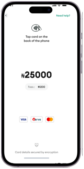
The SoftPOS feature turns a merchant’s phone into a card terminal — no extra hardware needed. Customers simply tap their card on the phone to pay, and the transaction is processed instantly and securely. For businesses that prefer external hardware, Nearpays also supports connecting a card reader for a more traditional checkout experience, with clear status indicators showing when a reader is connected and ready to accept payments.
Soft POS and Card Reader
Make Payment on the app
Paying with Nearpays is simple. Choose how you want to pay — single transfer, bulk transfer, or recurring payment — then add your recipient manually or pick from your saved beneficiaries. Confirm with a tap, and you’re done. It’s quick, secure, and every transaction is kept in one place so you can always track what’s been paid.
Make Payment on the app
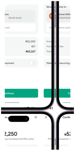
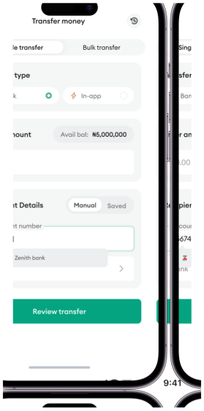
Business management
The Business Management feature gives users a centralized view of all branches, activities, and team permissions, making it easy to manage multiple locations with confidence.
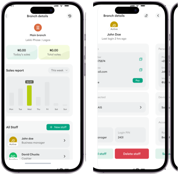
Branch Management: Users can add, edit, and manage branches while viewing sales and POS performance, making it easy to compare locations and track revenue in one place.
Staff Management: Users can add and manage staff, assign roles, monitor activity, and control permissions by branch. Role-based access ensures secure delegation while allowing owners to suspend or remove staff at any time.
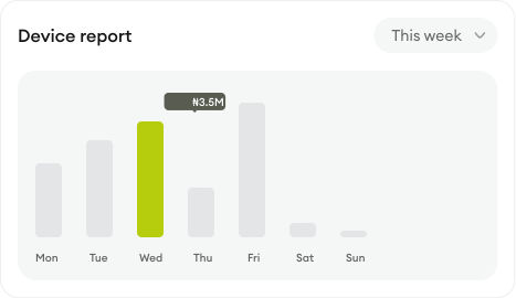
Report analysis
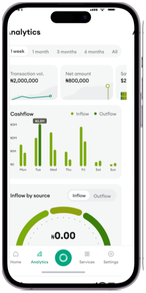
Nearpays’ report page gives business owners a complete view of their financial performance through key metrics, transaction breakdowns, cashflow trends, revenue sources, and business activity. Users can track net amounts, transaction volume, inflows, outflows, balances, payment channels, branches, and POS performance in one place, helping them quickly understand their business health and make informed decisions.
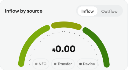
With this chart, users get a quick, easy-to-understand visual of where their money is coming from and where it’s going. Each category is shown in a different colour, making it simple to tell them apart at a glance.
Help and Live Chat Support
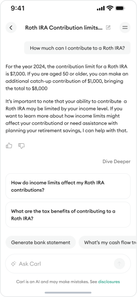
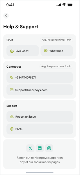
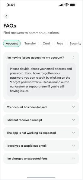
For real-time assistance, I designed an AI feature to offer a live chat support feature. This allows users to interact with a bot, getting timely help for their concerns.
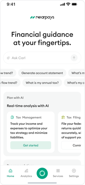
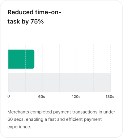
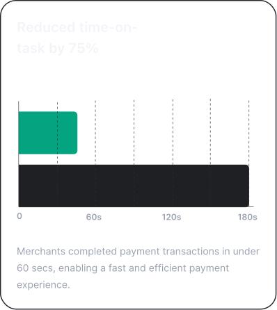
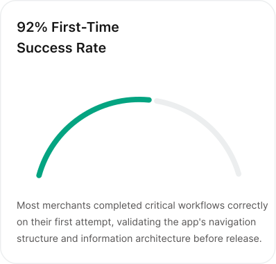
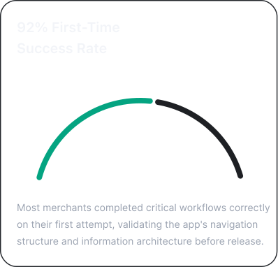
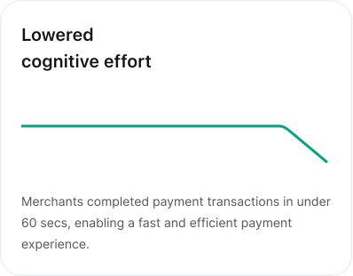
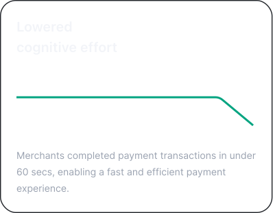
In the last few months, we have achieved significant milestones, here is a glance at the success metrics for both business and users.

The best business outcomes came from reducing friction and building trust, not adding persuasion.
- The most impactful design decisions came from changing the system, not screens.
- When the product logic is done properly, many of the UX problems solve themselves and the interface becomes simpler because the system became simpler.